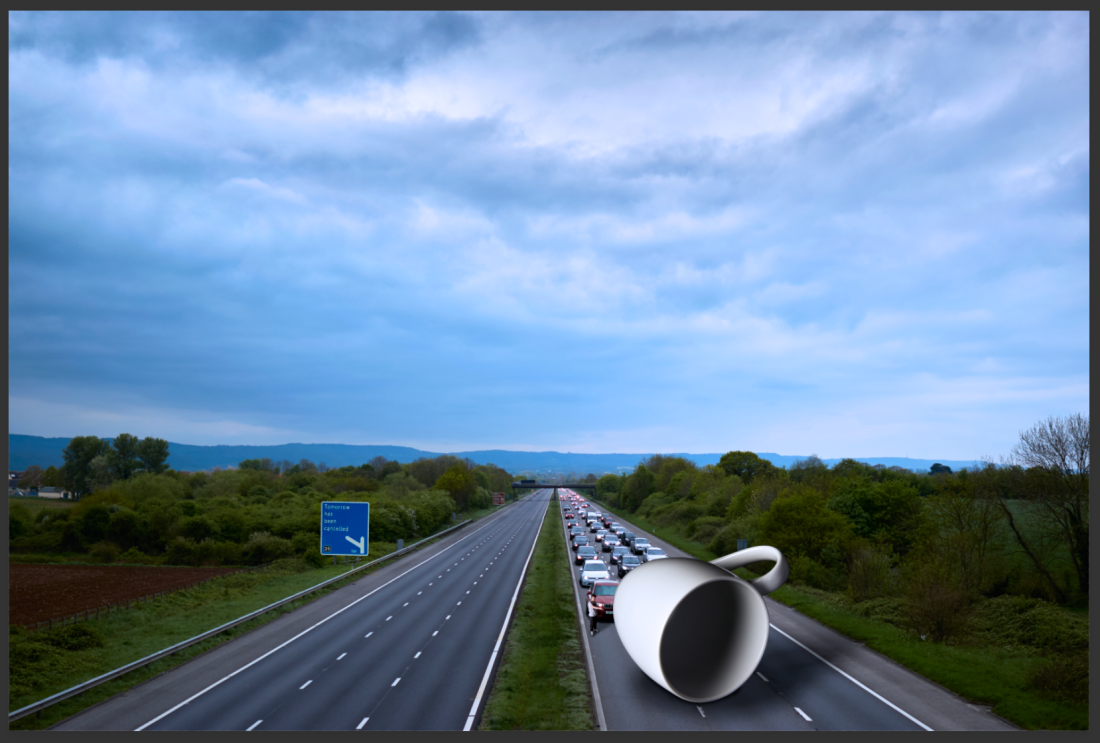
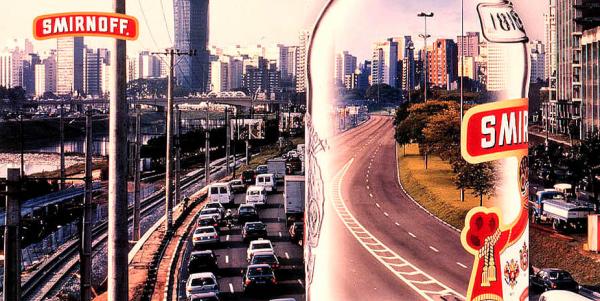
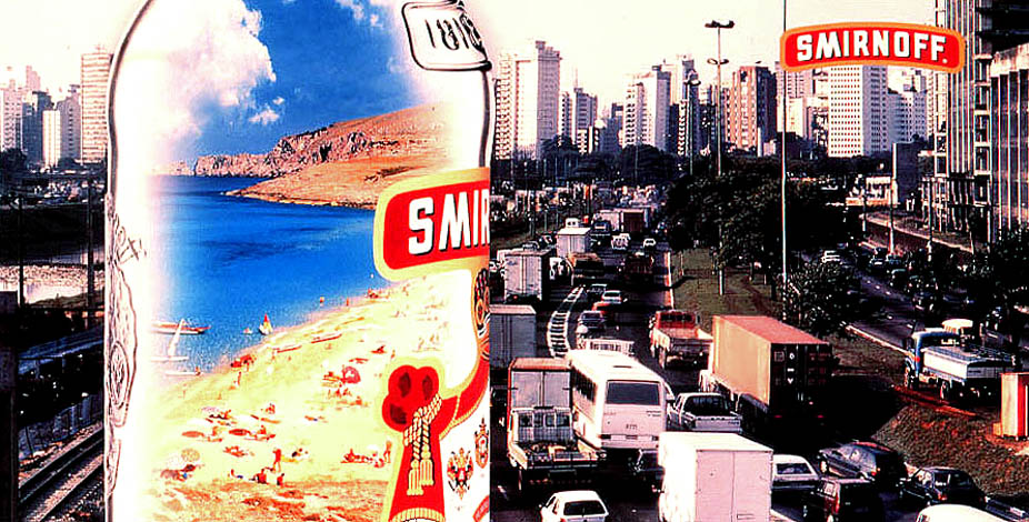
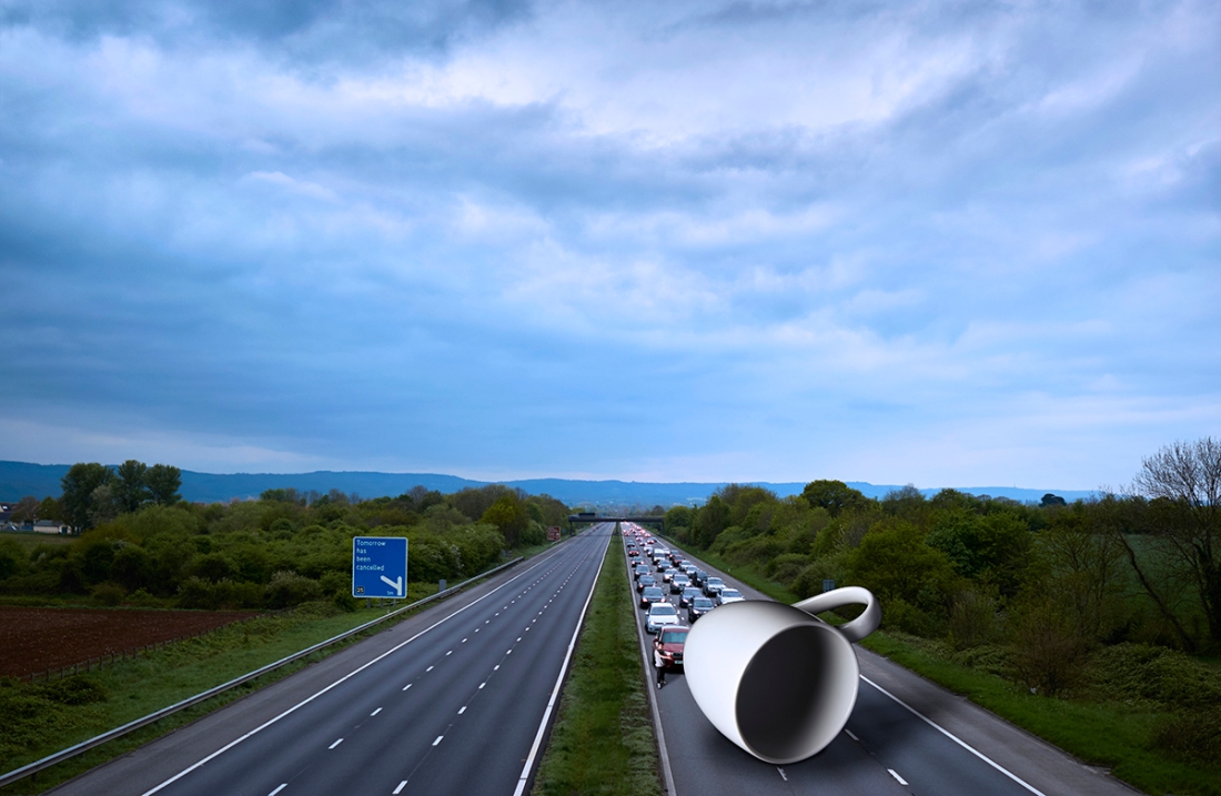
Digital Darkroom Evaluation

Final Composition

ryantrower.com

What went well?

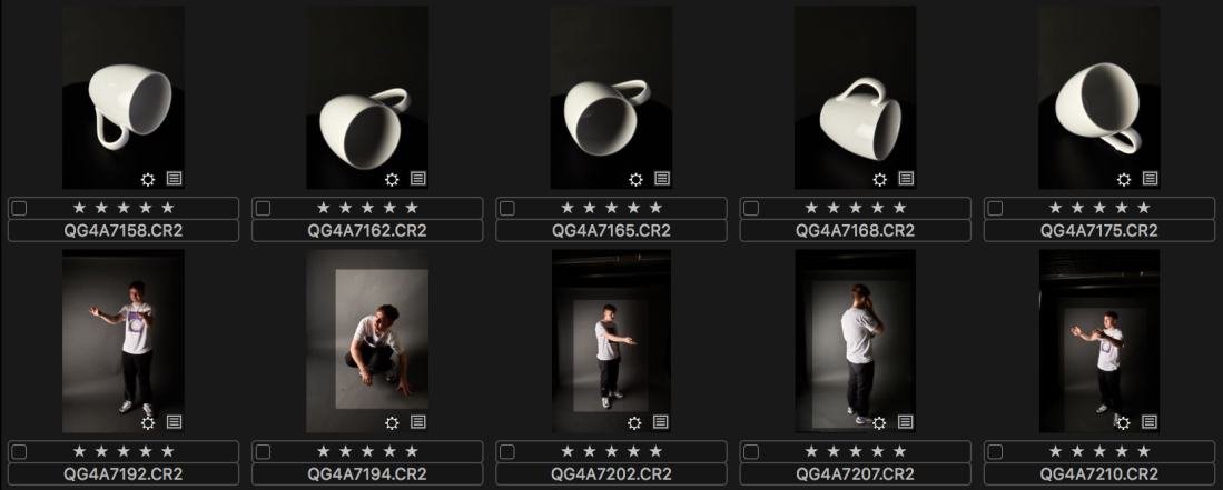
  • Even if I did find this brief to be very picky and stressful, I felt it was very useful to pick up new skills in Photoshop which will last me (with more practice) the duration of the course, and potentially into my career.
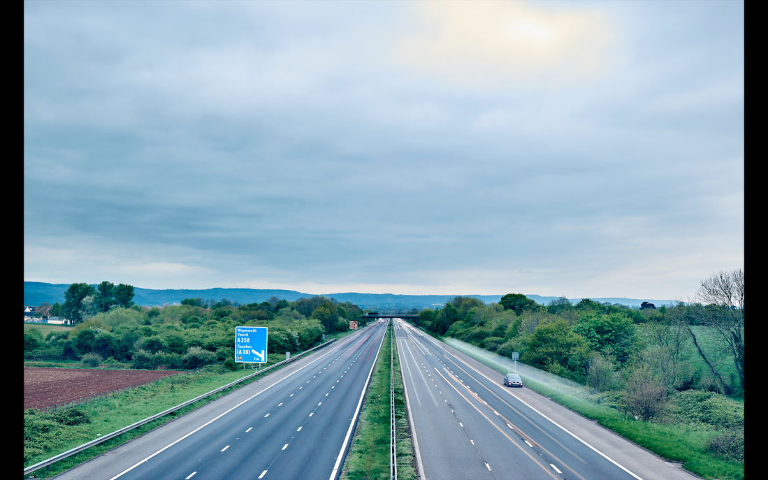
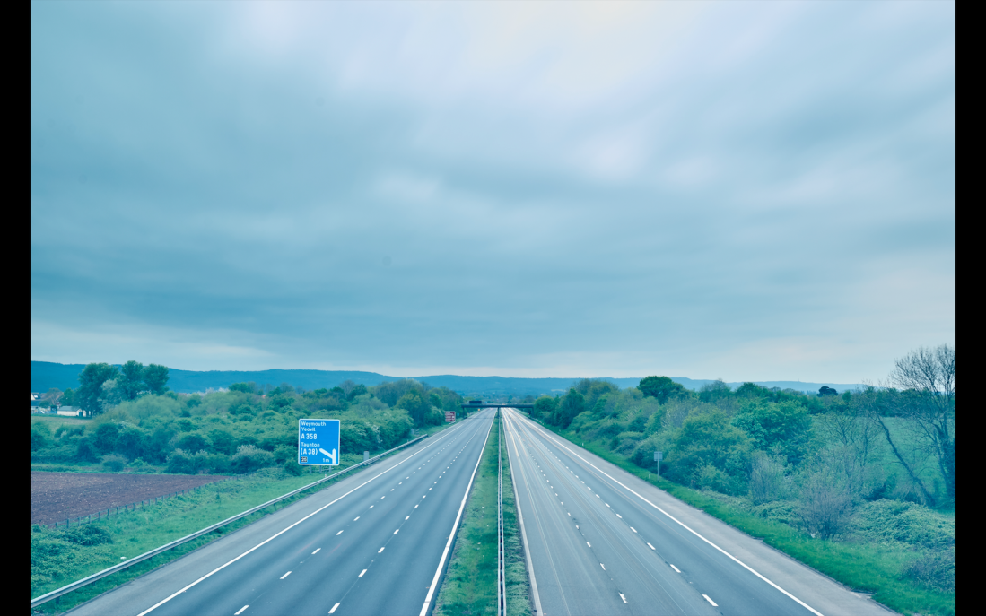
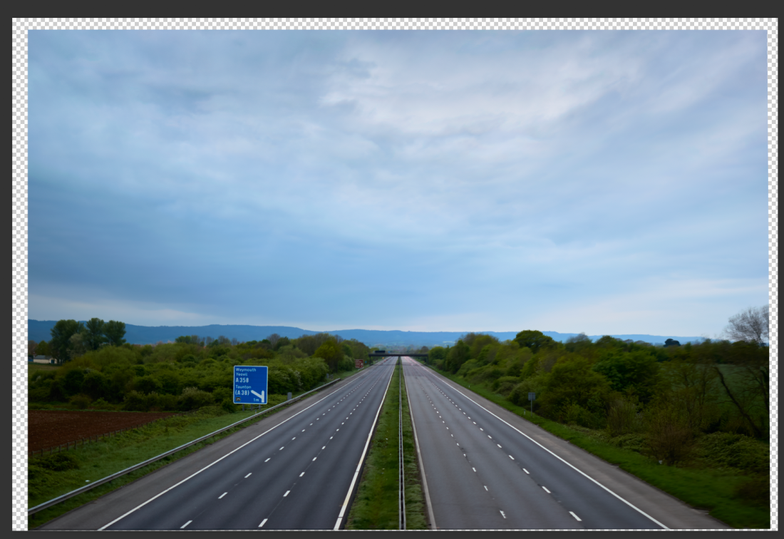
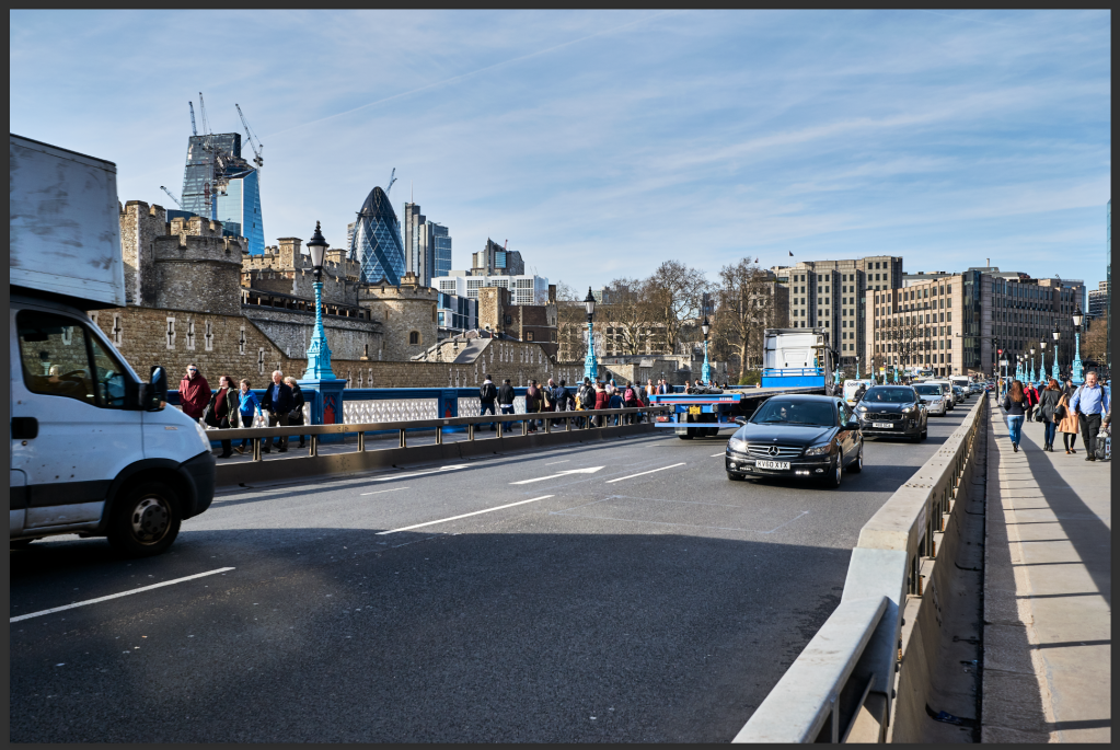
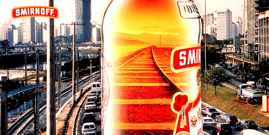
  • I feel that I was successful in creating a strong background image which I can use to base my compositions on. It did prove challenging, but it is something I was able to overcome once I looked for ways to fix the blending issue I was having.
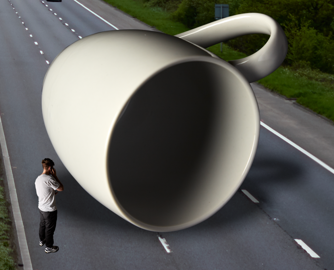
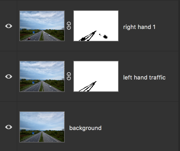
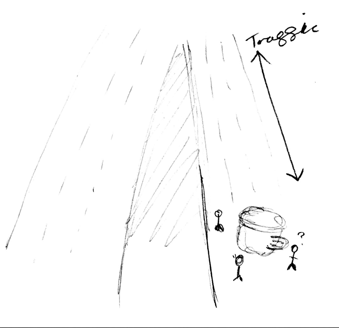
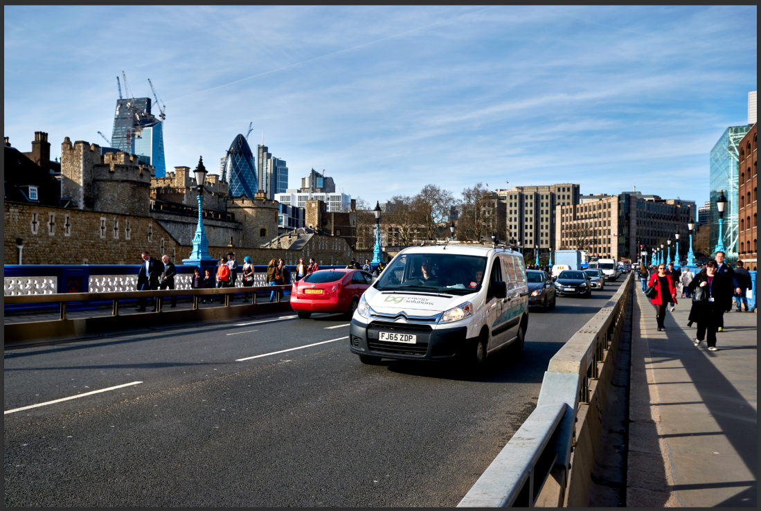
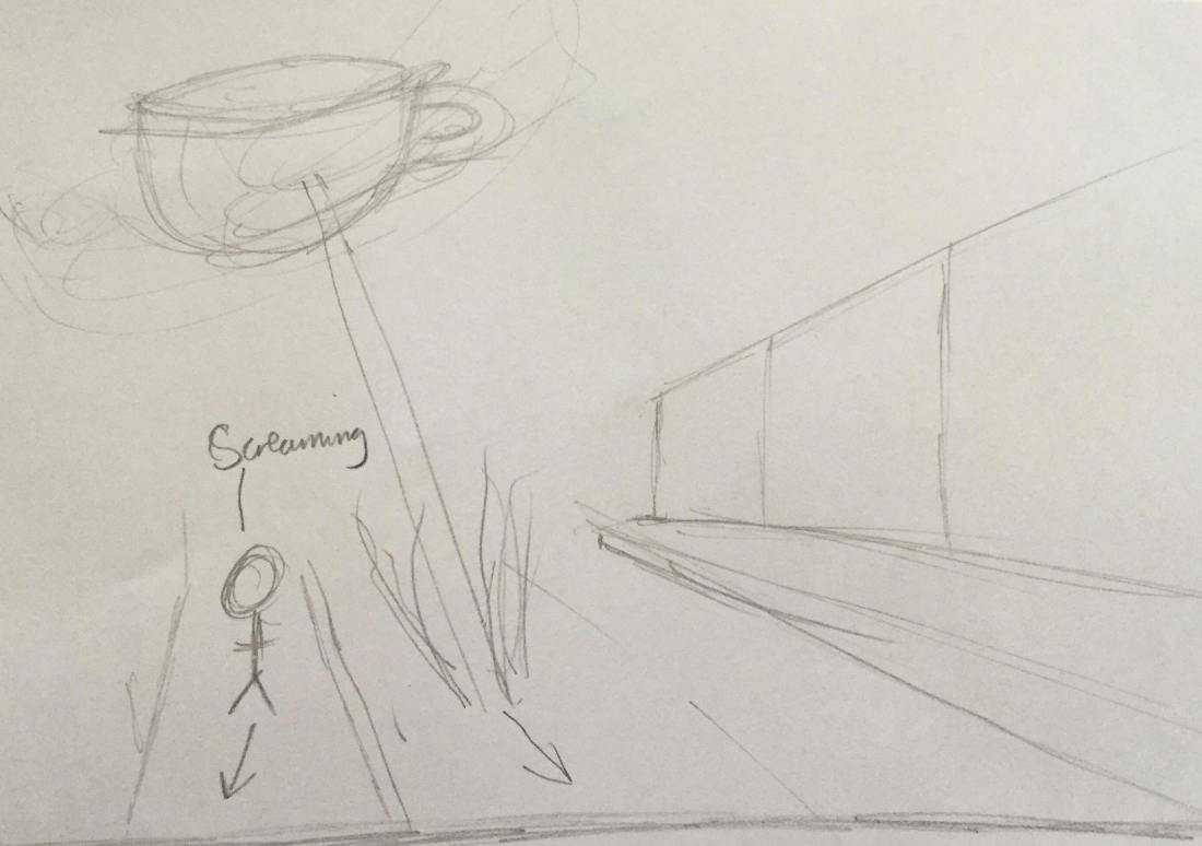
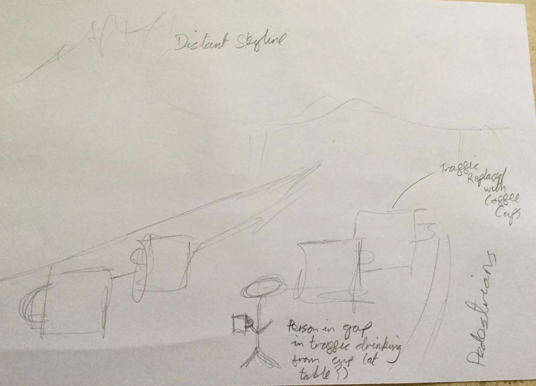
  • With a suggestion during one of the group sessions, I realised that my original art direction, while being semi-there (the central gutter for the double page spread bisecting the location of the coffee cup), was lacking in something. I have taken this suggestion on board now, which has made me more aware of these things for the future. This suggestion definitely improved the art direction of this project.

What didn’t go well?

I do feel like I could have gone further in developing these skills more by watching tutorials or attending the drop-in sessions after the group sessions. That being said, towards the end of this project, my motivation dropped massively; mixed in with the fact that I was moving back and forth between London, and my energy levels were very low. I think the lack of motivation in the first place stems from the fact that I am pretty anti-Photoshop (definitely a piece of software I need to become much more open-minded about), and an aversion to most things related to it; as this goes against my style of photography.

I used the Print Shop on campus to get the final comps printed, and while the quality was excellent, the print information which was supposed to be outside of the print had, for some reason, moved within the border. The text doesn’t affect the print itself, fortunately, but it is still irritating nonetheless (made even more so by the fact that I didn’t have any time to get it reprinted.)

What would I do differently next time?

  • I need to try and keep myself motivated, and take on board more of the feedback I receive during group sessions, and use this feedback to push myself further and learn even more skills.
  • I also need to become much more open-minded about pieces of photo editing software like Photoshop.
  • I had to bring forward my hand in date, which gave me slightly more pressure, however, I should have given myself more time when it came to the final print.

Digital Darkroom Final

Model Comp

Screen Shot 2018-05-19 at 16.32.28

I realised that my original pose, with the model’s back facing the viewer, didn’t work as well as the final pose I decided on. Although in the entire composition, the model takes up a very small part of the frame, is it possible to get a greater sense of confusion for the coffee cup having landed in the road, from the body language more than the facial expressions.

Screen Shot 2018-05-19 at 16.41.13

As I was scaling down the model, I converted the layer to a smart object, and then applied a slight gaussian blur so it stood out less against the cut-out cars behind him. The shadow was more of a task, as whatever angle I moved the duplicated layer to, the position of the feet would move. I attempted to use the puppet warp tool to try and correct this, only for the layer to become warped to the point where it doesn’t even resemble anything that could work as a shadow.

Both of the shadow layers are at a fill percentage of 40, with layer 63 acting as the ambient occlusion.

Crop Previews

Single page and double page formats, using the 1:1.41 ratio (the same as A3 paper). This composition works very well as a double page spread, as well as a single page; however, the sense of symmetry is lost in the single page crop.

Colour Grading

It has been mentioned several times that it would be worth brightening the entire image. However, after trialling some grades on Colour Efex, I quite like the moodiness that was created by having it darker. Not wishing to go too overboard with the grading, I ended up  simply using the Darken/Lighten centre tool, with several minor adjustment layer tweaks.

Screen Shot 2018-05-19 at 16.52.53

Screen Shot 2018-05-19 at 16.53.26
After
Screen Shot 2018-05-19 at 16.53.39
Before


Cup and Model Comp

I have now managed to shoot my second attempt at a coffee cup, as well as a model for this brief.

Screen Shot 2018-05-05 at 13.34.22

It took me a while to get back into the flow with working with Photoshop, but it came back to me eventually. I have decided to focus on the separately shot elements first before I work on comping any of the other elements in the background.

With the cup, it took me several attempts to use the pen tool to cut it out, but again, I got there eventually. In this case, though, the problem wasn’t so much the cutting out, it was the lighting conditions that the cup was shot using. The whole background image has a fairly flat light, with the overcast sky casting few shadows around any of the objects. Though they aren’t big, you can see on the cars that there aren’t any strong shadows at all. The inside of the cup would obviously be darker, however the outside surface wouldn’t have such a difference between the highlights and the shadows.

I used a 1×1 metre softbox to shoot this, with a white sheet of paper acting as a reflector. The reflector definitely helped brighten the shadows a little here, however, it was not enough. I had the softbox set about two metres away from the mug, which was placed on a black surface, although it would have been better if the softbox was on a lower power, and set closer to the mug so that the light wraps around the ceramic more.

The same applies to my model, though the more I look at the way he is standing in relation to the mug, I was shooting him from the wrong position. When I am able to reshoot, I will try to shoot the model from a higher angle.

Screen Shot 2018-05-02 at 17.36.25

I was unsure about how I could create the drop shadow for the mug, and for the model. However, I watched a brief Youtube tutorial and figured out the rest for myself. I duplicated the layer, and dragged it down so it looked as though it was squashed. Using this layer, I made a selection in a new blank layer after hiding the squashed-mug-layer, and expanding it by 20 pixels, and feathering it by 30. I repeated this process, this time contracting it by 20 pixels, and feathering it by 10.

I have not added any ambient occlusion in this shadow, which prevents it from looking as realistic as it could be (at least, as realistic as a giant coffee cup on a motorway could get.) As well as this, as the sun was in the sky to the left of the image, I need to reduce how long the shadow is on the left-hand side of the mug, to create the effect of the shadow actually being cast.

In terms of art direction, I am still left slightly defeated as to what I could possibly do. I still plan on having some kind of traffic jam, but I was unsure as to how much of a tailback I would like to create, as well as how many people I want to have in the foreground as the first people at the scene. Thinking about it, and after discussing it, having just one person creates a different story to multiple people, as it looks as though the ‘landing’ has only just happened. Having multiple people in the shot would make it seem like there was much more confusion as to what had happened.

It was also suggested that I add cracks of some sort, either in the cup, the road, or in both. I don’t think this would work too well, and it’s not something I would like to try in this composite.

Composite (Stress) Images

I’ve spent the past two nights feeling like my head was going to explode as I attempted different ways of beginning the composite image. I realise that I still have the cup element, as well as the human elements to shoot, and I get the feeling that these won’t be as tedious or as stressful as the work that needs to be done for the background.

Initially, I shot 150 images from the motorway bridge, and tried two different ways of stacking them in order to use layer masks to remove/add vehicles to the different carriageways.

The first attempt, in which I loaded each image into a stack, failed. My first issue here was exporting each file out of Capture one as a 60mb .psd file, which considerably slowed down the process, and, further than my head exploding, seemed to make my laptop want to burst into flames. I stopped this process, and instead exported each of the images out of C1 as .jpg files. I still had issues with slow speeds (I believe C1 is out to destroy both my RAM and my SSD). The next issue I faced was when it came to using layer masks. As the images were shot so close together, I found that using layer masks wasn’t effective, as it would just reveal the same vehicle slightly further up the road.

My next method to try to create a blank canvas. I did this by using the median statistics script to stack and remove differences between images. This was mostly successful, however I found that the foreground remained in focus, while every part of the background became blurry.

To work around this, I returned to the bridge the next day and shot under similar conditions (albeit later in the day). I shot fifty images here, instead of 150; as well as several long exposures.

Screen Shot 2018-04-30 at 12.52.56Screen Shot 2018-04-30 at 12.52.54Screen Shot 2018-04-30 at 12.52.52Screen Shot 2018-04-30 at 12.52.50

When merged together with the same script, I was left with quite a successful result. It does involve having to have a slightly tighter crop, however I am still left with the central reservation in the centre of the image to act as the gutter.

Screen Shot 2018-04-30 at 12.55.19

The background here is still slightly out of focus, however, using one of the fifty images I shot as well on that day, I was able to use a layer mask to show a sharper background.

Screen Shot 2018-04-30 at 13.15.09Screen Shot 2018-04-30 at 13.15.17Screen Shot 2018-04-30 at 13.15.29

What’s stressing me out here, is that whenever I add in another layer, made from one of the individual images, and duplicate the layer mask, I keep getting faced with the same issues as before, where brushing in one vehicle removes another which I need to be kept in place.

One thing I could try here is selecting only the right hand part of an image, feathering it, and then copying it as a new layer into the main composite. This should, in theory, save time as well as helping my laptop handle the image with less strain in the processor. Alternatively, I could reduce the extent of the traffic jam, and make it seem like the ‘crash’ has just happened. Rather than have a fully fledged tailback, I could have it seem more like the traffic is only just starting to back up.

Change of Plan

After attending a group session and sharing my idea, I have come to change my idea on reccomendation. My initial idea of having the coffee cup cause some kind of traffic jam was sound, yet the initial background image which I had shot lacked good art direction. This was something that was hard to avoid, due to the anti-terror barriers along the sides of the approach roads to the bridges in London. Thinking more about it, there weren’t any other location in London which would work for this idea, so it was suggested to try somewhere different, such as a motorway bridge.

Fortunatley, about five minutes from my house, there is a bridge which crosses the M5 motorway at an arrow straight section, creating a natural gutter which I can use to aid the composition.

Rather than having the cup be a ground vehicle, the cup should act as if it had crashed ‘from space’, drawing upon my very first idea inspired by le Gouet.

IMG_6165

Digital Darkroom Plan Update

There always seems to be an element of my idea which seems to change at least once each day.

After seeing a coffee cup comped roughly into the background image, I realised that having a person inside the cup would look quite bad. I know that the idea for this project is to have an image that would only work through creating a composite image, but placing someone inside the cup seems like something that will be overdone.

My newest idea is to remove the person from the cup and have them crouched down beside it as if they were checking the base of it for something. I want to treat this coffee cup as a vehicle which has broken down and is holding up the traffic on the approach road to the bridge.

Composite Cup Shots

Screen Shot 2018-04-23 at 13.06.27

Well, that didn’t work. Throw into the mix that I forgot to take QP readings, as well as the fact that my still life set up was far from perfect, it is safe to say that I am going to have to reshoot the cup images,


This slideshow requires JavaScript.

I initially test fired a few images to see how it would work out. The set up I used here was a wooden box with a sheet of clean white paper over the top, set quite far away from the backdrop. I noticed that in these test shots, the shadow was far too long, as I wasn’t taking into account the fact that one of these lights was representing the sun itself, so I moved the key light further around, as well as increasing it’s height, to shorten the shadow.


I tried several positions for the mug, which appeared to work well until I processed one of them and placed it in the background image to test it out.

I realised that I was shooting at too low of an angle, as the tripod was only extended by one leg, while the background image was shot at two legs high. As well as this, the background subject was farther from the camera.

Also, I was shooting with an octolight as well, which threw in more light than there would be in the background image. To better recreate the conditions of the background image, I need to replace the octolight with a silver reflector. As a backup, I could simply move the octolight further back from the mug.

30772319_1674619189312837_1568016604_o

To get greater detail in the cup, I need to shoot much closer to it or shoot at a longer zoom. As I can add a shadow in post, I can focus more on the cup itself, rather than including the shadow.

The cup itself could be an issue too. The cup I used in this shoot was very difficult to cut out, and proved to be very reflective. There is not much I can do about the reflective surface, however, I can try shooting with a different, more plain looking cup.

Ideally, I would be shooting this on a still life table, which is something that the university doesn’t seem to have after looking at the CLR site.

Background Image for Comp

I spent an afternoon in early April shooting around London the images which I could use as the background for my composite image. My original plan was to shoot on the south-western end of London Bridge, with The City in the background, and the busy traffic on the bridge acting as the elements which I could replace with the coffee cups. I found though, that on the day I shot, the northbound section of the bridge was closed to all traffic except for busses, which caused me to change my plans.

I shot on the northeastern side, facing south instead. While I am happy with these images, and they would work well as the background, I was hoping for there to be more traffic, and therefore more elements for me to alter.

I instead walked to Tower Bridge, which, fortunately, was much busier; both in terms of vehicles and pedestrians.


Screen Shot 2018-04-21 at 20.58.51
This is the image I will use for the background. There is enough space on the left of the image to place the coffee cup and create or place a shadow; there is a good portion of action taking place on the right-hand side with pedestrians, as well as the opposite side; and there is a good amount of traffic backing up which I can place coffee cups over.


Initial Ideas

I’m finding researching this project is proving far more tedious than for any of the other projects. I keep finding myself going back and forth between all of the photographers who have shot for the Lavazza calendar in the past, and I’m finding their work to be increasingly dull and, understandably, highly commercialised. While I can appreciate the work that went into them, this is far from the kind of photography I enjoy.

While I welcome the challenge to be able to create a composite, I feel as though the researching part is what will, and what already is, affecting my motivation and desire to continue this project to my full ability.


30176500_1662400197201403_1943304026_o

My very first idea was an advert inspired in part by Thierry Le Goues’ work, and 1950s B movie posters. This would have contained a giant coffee cup in the sky, shot on a street likely in the West End (at night, most likely), with someone running away from it screaming.

I let this idea simmer for a while, and the more I thought about it, the less I thought this idea would work so well. After carrying out some more research on different adverts consisting of composited elements, I have a second, more workable idea which I think will be of a higher quality.

30173943_1662400217201401_564536387_o

This idea will be based on the concept of coffee breaks, and the idea of breaks from the stresses of life. The main background image will be of a traffic jam, or a stationary, busy street at rush hour. I will make sure that there is space between two cars, so I am able to comp in a model, sat down on a chair, possibly at a table, holding a coffee cup. I’m still thinking of how I can incorporate a still life element into this image, though one idea I have is to replace all of the traffic with various coffee cups.

Smirnoff


These print adverts below were used in late 2000 in Brazil, and were shot by the advertising photographer Marcio Rebelo. They play on the idea that Smirnoff Vodka is filtered ten times and show more desirable scenes within the bottle.

udv-smirnoff-vodka-railway-beach-clean-river-bicycle-trail-no-traffic-outdoor-26097-adeevee


udv-smirnoff-vodka-railway-beach-clean-river-bicycle-trail-no-traffic-outdoor-26100-adeevee
These two above probably the worst as print ads, as the gutter is likely to sit right in the centre of the bottle.

smirnoff-vodka-no-traffic-small-41157


udv-smirnoff-vodka-railway-beach-clean-river-bicycle-trail-no-traffic-outdoor-26098-adeevee

These images are mostly composed of three images: the wider landscape, the bottle, and the landscape within the bottle.

I definitely prefer these comps over the Lavazza calendars, and I seem to be getting much more inspiration from these Smirnoff ads. From here, I think I will change my initial idea to something a little more grounded. Something tells me that I’m going to need a lot of smart objects for this one!