Lavazza Calendar Photographers

Like the UK and the USA, Lavazza Coffee pride themselves on having a special relationship with photographers; describing both coffee and photography as ‘children of our age…consumed quickly [leaving a] delightful aftertaste’.

Many top photographers of the time have shot for Lavazza’s calendars, helping the company to keep itself current.


2018 – “2030: What are you doing?”Platon Antoniou

This calendar, shot by Platon, is designed to make people question what it is they are doing when it comes to sustainability. Each month offers a different portrait of someone fighting for the world, along with what it is, in particular, they are fighting for, which is displayed on a white shirt. There are 17 portraits in total, each one a point set in 2015 by the world Agenda for Sustainable Development.


Screen Shot 2018-03-23 at 12.53.49

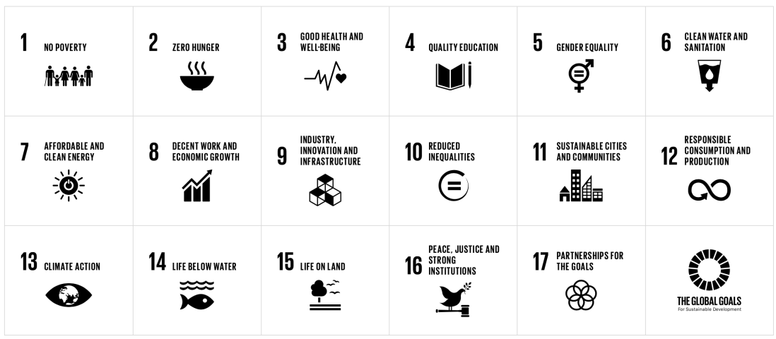
These are the least coffee related of all of the calendars that I have seen (if only because of the absence of any physical coffee cups in the images), but just go to show that Lavazza is working towards a sustainable future, although it is a considerable step back from what Lavazza have published before in terms of composite images.


2009The Italian Espresso ExperienceAnnie Leibovitz

This is composed of simple studio sets (likely green-screened) which have been manipulated to look like famous Italian icons, such as the Trevi Fountain, or the Vitruvian Man. Each image contains a model who is holding a coffee cup, or is part of a coffee cup in some other way.

Named a living legend by the Library of Congress, Leibowitz is undoubtedly the most sought-after portrait photographer living; having shot countless advertising campaigns, magazine covers, and just straight up portraits.

She has mastered both simple portraits on a plain background, to huge sets with multiple, separately shot elements composited into one.  Because I am more aware of what to look for, I find it easier to tell which elements are comped into another. A good example of this is the image with Bruce Willis above, which sees him standing on a stationary bike, with elements which suggest motion being added in post.
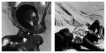

2004Mission to Espresso – Thierry Le Gouès

This is probably my favourite calendar from Lavazza’s collection. Inspired by the amalgamation of the 1960s and 1970s pop and sci-fi imaginations, this set of images is tacky, yet with high production values (which seems even better, considering these images are fourteen years old.)

These images were likely shot almost entirely on set, with only a few elements being comped in, such as the floating coffee and cup, and the lights beaming from the cup. The ‘cup-man’ could have possibly been comped or green-screened in, also; although this looks just to be some kind of elaborate costume.


After watching the video which I linked above, I learned that all of these images were shot on a set in a studio, and are pretty much 100% prop based.


Le Gouès is Fashion and beauty photographer by trade, having shot for numerous, predominantly French, clients, including Chanel, Roger and Gallet, and Aubade. He also has published several books of his personal work, including ‘Havana Boxing Club’, ‘Amazones’, and ‘Soul’.

Both his professional work and personal work differ greatly from his work for Lavazza, although I think this is a rare case where the highly staged work seems to work better.


Colour Grading with Nik

Using the Nik Suite for Photoshop, we are able to colour grade out images to a much higher level. These are very similar to Instagram filters, however, there is a much greater degree of control with these effects. I had some experience with it in the past, though I had never got to grips fully with it. Now I know more than the basics, I am much happier with shooting work in colour, as well as being safe in the knowledge that my usual black and white work will become even better.

Silver Efex Pro

Colour Efex Pro

To save the destruction of the original layer, each adjustment is saved as a separate layer in Photoshop, with the option to save it with an invisible layer mask, to brush the effect in subtly.

As well as Silver and Colour Efex, there is also an input sharpener and an output sharpener, which appears to work quite well, again with a lot of control over elements which the sharpeners in Photoshop, Lightroom, or Capture One will not allow.


Screen Shot 2018-03-06 at 14.24.34.png
Left – Before // Right – After


Double Exposure

Screen Shot 2018-03-03 at 12.13.04

Screen Shot 2018-03-03 at 12.18.49.png

One of the most useful tools within this task was the selection tool. Rather the various methods of selecting and cutting out a person from an image. Using a quick selection, I selected my outline, and then used the select and mask tool to refine the edge with the refine edge brush. This allowed me to pick up many finer details, mainly hairs, which the quick selection would have otherwise missed.

Made easier against a solid colour backdrop, I still faced difficulties with my version of Photoshop not letting me use the onion skin overlay on the Select and Mask tool. Instead, I settled on using the black and white overlay.

Screen Shot 2018-03-03 at 12.19.52

This probably made it a little easier, although I can’t say much as I was never able to try out the onion skin overlay.

I copied this cutout into a new file. As the background was now a solid white, I was able to use the crop tool to extend the width of the document. To increase the contrast between the cutout and the background, I duplicated this layer and added a high pass filter; to the point where finer details begin to emerge. In my case, this was around fifty-nine pixels. Contrast can be further increased by applying levels adjustments to individual colour channels, in particular, blue.

Screen Shot 2018-03-03 at 12.31.23

Screen Shot 2018-03-03 at 12.28.43.png

After gathering images, I then began to add them to add them as layers. Depending on the placement of these images, it is important to create an inverted layer mask, to allow you to erase parts of the image and reveal the layers beneath with a white brush (layer 4 was not over the portrait in any way, so a layer mask was not necessary). The first layer, I set the blending mode to normal to increase the impact, however with the other layers, as is the way with multiple exposure portraits like these, I set the blending mode to lighten.

Screen Shot 2018-03-03 at 12.33.36.png

The majority of these images were easy to cut out and paste in, which made it easier to move them around to a place where they worked most effectively. I tried to mix black and white images alongside colour images, which I think has worked quite well.

Screen Shot 2018-03-03 at 12.37.54


Two Part Car Comp


Using these two images I shot around Greenwich, I used paths to create a two-part composite image, seen below.

final comp with drop shadow.jpg

To get to this point, I cut out the outline of this car beside the naval college with the pen tool, being sure to cut out any of the background which may show through, for example, in the gaps of the wheel.

Screen Shot 2018-02-20 at 17.32.03.png

Screen Shot 2018-02-20 at 17.26.32.png

The pen tool proved to be quite tricky at first, but when I figured out that the path the cutout took could be changed by holding down the option key and dragging the tool in the right direction, things became much easier. From here, I made the path into a selection, and feathered that selection by half a pixel. I copied this cutout into the background.

Here, I duplicated the background layer, as well as the cutout layer, converting that into a smart object so that the pixels would be protected if the cutout were to be scaled up or down in any way.

In order to make it look as though the cutout was ‘parked’ between the two Fords, I had to create a layer in front of the background, by using the pen tool to cut out the back end of the brown Ford. This was then selected and feathered by half a pixel, and then copied above the cutout layer.

From then on, I moved the cut-out car around, scaling it up a little and rotating it slightly so it lined up with the rest of the cars in line. I again used the pen tool to create the shadow directly beneath the car, feathered by ten pixels (as seen in layer three). I went further by creating ambient occlusion beneath this layer. Again this layer was feathered by ten pixels, but I achieved this effect by introducing a graduated fill into the selection with a soft light overlay, to make the effect appear more subtle.

Screen Shot 2018-02-20 at 17.27.29

I think in terms of the ways I could improve this, I could definitely start by shooting a larger image to actually comp into the background. I found that this car, being too small, left me with quite a crunchy image which doesn’t look as sharp as the rest of the image. On top of this, I should have shot the QP card shot in front of both images, rather than after I had shot both of the images; I would have likely ended up with images with a less yellow tint to the,

Photoshop Debates and Beauty Retouching

The whole concept of ‘Photoshopping’ has brought to light many debates behind its ethics. This idea has been around since the times of the great painters, who were not always able to capture every detail of their subject, and thus would make changes accordingly.

Personally, I think heavily photoshopping anyone just creates a lie, a false advertisement of a person, which isn’t actually ‘them’. It’s what the magazine wants people to see; although it is understandable (if wrong) that publications use this to such a degree. If the model looks bad, they will distract from the magazine. Magazines want their models to fit their idea of perfect, and the public want their idols to look perfect.

However, if they want their models to look perfect if, say, this is an advert for a skincare product; if their product is ‘so good’, then what is the need for Photoshop?

Although, this seems to be creating a shift towards a different mindset, from both the public and from models. There is a desire for a more relatable feel between fans and the people in front of the camera, with more models adding ‘no Photoshop’ clauses to their contracts to add to this trend.

But this doesn’t detract from the major problems Photoshop has cause, and will likely continue to cause in the future, in regards to eating conditions such as anorexia and bulimia, brought on by people expecting to reach the same unrealistic standards of beauty they see on the front covers of magazines.


Beauty Retouching

So of course, the next logical step is to learn how to use Photoshop in this way.

This is quite a heavy retouching process, and thus requires good organisation when it comes to layers. This can all be sorted by using folders, in this case:

  • Retouch
    • This contains usually a minimum of two layers: reduce, and remove.
    • The remove layer is used to, as the title suggests, ‘remove’ aspects of the image.   In this case, I used the spot healing tool (J) to remove any spots and stray hairs from my face and neck, as well as any messy hairs on the top.
    • The reduce layer is used to do the same, but for features which may add character to the person in the portrait, or which would otherwise be distracting if left untouched (things such as moles and large freckles). The reduction comes from the reduced opacity.
  • Shine
    • This is used to reduce the shine on someone’s skin with the patch tool. This requires a pixel based layer (shift, option, command, c) onto which the adjustments can be made.
    • Further, highlights can be isolated using the colour range tool by creating an inverted layer mask (command+I).
  • Light
    • Two adjustment layers are used here to dodge and burn the portrait to flatten the shadows and the highlights.
    • For highlights, the curves are adjusted to darken the portrait, then with an inverted mask, the highlights can be brushed over a white brush.
    • For shadows, the curves are adjusted to lighten the portrait, and then with an inverted mask, the highlights can be brushed over with a white brush.
  • Skin
    • This is the most complex adjustment I have learned so far. This affects the overall texture of the skin, but different methods are used depending on whether the person in the portrait is male or female.
    • For both men and women, a new pixel based layer is created, and a high pass filter of around five pixels (depending on the portrait) added and inverted.
    • For women, the blending mode is adjusted to linear light, and a gaussian blur added and adjusted until the skin is smoothed, but retains some texture.
    • For men, the same process occurs, however, the blending mode is changed to soft light, instead of linear light. No other work is normally needed.
    • Continuting, a new inverted layer mask is created, and the skin brushed over until the desired effect is reached.
  • Colour
    • This can become quite extreme, but works well if done properly.
    • First, a black and white adjustment layer is created to slightly increase tonal contrast.
    • Then, the colour balance tool is used on a pixel based layer to adjust certain parts, such as the lips, or any make up which is already in place, or can be added in.
  • Sharpen
    • The final step can take many forms, yet the one I used here, and will likely use again, is slight high pass filter with a soft light blending mode.

Although this is not what I normally shoot, it was very useful to learn this skill, and it is definitely something that I will take further in any personal work I shoot in the future which may require portraits.